RESPONSIVE WEB DESIGN CHECKER
HOW RESPONSIVE IS YOUR WEBSITE?
ABOUT
RESPONSIVE DESIGN
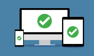
Internet use is no longer limited to desktop devices of yesteryear. Rather users access the internet from their home, their tablets, and their phones. Responsive design gives your website the flexibility to attractively display content regardless of device size.
So, What Exactly Is a Responsive Design?
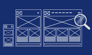
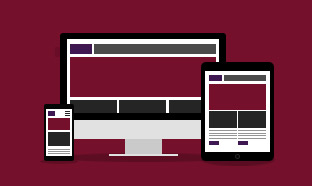
Responsive design simply refers to a website layout that responds (scales itself) automatically to an array of devices (screen sizes) and resolutions. Basically, it’s mobile and tablet friendly.
That way, whether you’re using a personal laptop, a notebook computer, or you phone, you can access the same website on all of them without losing quality. The idea of responsive design is that the same website will look great while you’re browsing the web on your phone and on your computer without sacrificing any of the quality or ease of navigation.
It’s important to stay up-to-date with the most popular screen sizes and resolutions when designing web and mobile sites. Learn more in our blog article here.
Heads up!
Some websites might not show up here in the Responsive Design Checker. This happens because some sites have special security settings that don't allow them to be viewed in tools like this one. If your site doesn't load, it's likely due to these settings, and that's totally normal! If you run into this, you might want to try other ways to check how your site looks on different devices.
Responsive Design: What to Expect
Start with the End in Mind
Designers and developers work together to wireframe, or outline, the website. This phase must consider user experience (UX), interaction with site elements, and results in a basic design concept.
Create Complimentary Layouts
With basic elements determined, designers craft designs for various screen sizes while maintaining brand integrity, layout and user experience consistency. As screen sizes decrease, elements often stack, scale or collapse into expandable sections.
Expect Some Shifts
Everything from image and font sizes to navigation structure may need to change between screen sizes to ensure a quality user experience.
Programming Magic
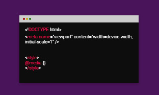
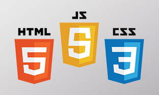
Developers use the design parameters to write the website code. Media queries are included to validate the size of the user’s screen and to then display the appropriate layout.
Evolution
Today’s web development is not about one-size fits all solutions. It’s about taking advantage of the opportunities presented by new technologies and using them to craft meaningful and effective user experience.
Responsive Check-ups
With technology constantly changing and evolving, it is important to check-up on your responsive design at least quarterly. This gives you an opportunity to identify if there are any responsive issues with your website and make any necessary updates.
ABOUT
MEDIA GENESIS
Responsive Design Checker was initially created in 2012 as an exercise for Media Genesis developers to see if they could create a tool that could be used to test websites for mobile design. Essentially, developers wanted to see how well certain websites could adapt when viewed on mobile device (like a phone) rather than just on a computer desktop.
As it turned out, it was a smash hit! But not necessarily with developers. Responsive Design Checker was appreciated more by non-development web users as it was able to determine if a website would be responsive while in mobile format.
Later updates to the system were made in 2015 in order to include a variety of preset screen sizes such as the 27-inch Dell Monitor U2711, 17-inch Workstation, 15-inch Macbook Pro, 11-inch Macbook Air, and the portrait and landscape modes of Apple’s iPad and iPhone, and the Nexus7.
Why Is Responsive Design Checker needed today?
Responsive design = good user experience. So, if you want to be able to provide your user a good experience (no matter what device they’re accessing your website from) you’re going to need a responsive site.
Not to mention, mobile usage counts for just about 50% of all website traffic, so it’s essential that your site is able to not only meet user demands but also adapt to any device screen.
That’s where Responsive Design Checker comes in. You can discover how your website looks on a variety of different screens, including desktops, laptops, tablets, and smartphones. It’s as simple as typing in your web domain and hitting “enter.”
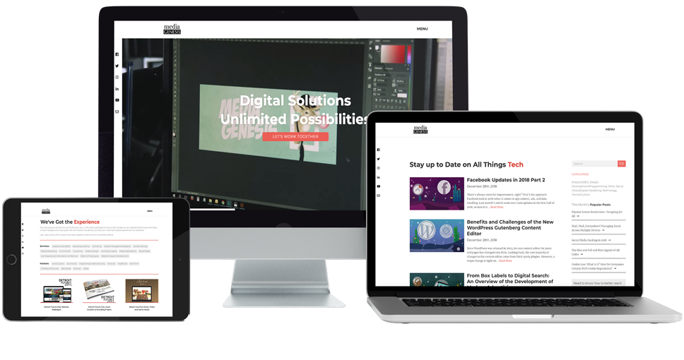
Do you need a website developer, graphic designer, or a team of professionals to create the perfect digital marketing campaign for your company? Media Genesis can help. Since 1996, we have worked alongside corporations worldwide, both big and small, to help them tell their stories. Give us a call at 248-687-7888 or email us at info@mediag.com.
880 W. Long Lake Road, Suite 225
Troy, MI, 48098
Phone: 248-687-7888
Fax: 248-687-7889
Email: inquiry@mediaG.com
MediaG.com